
Waissburg
the evolution of a legend
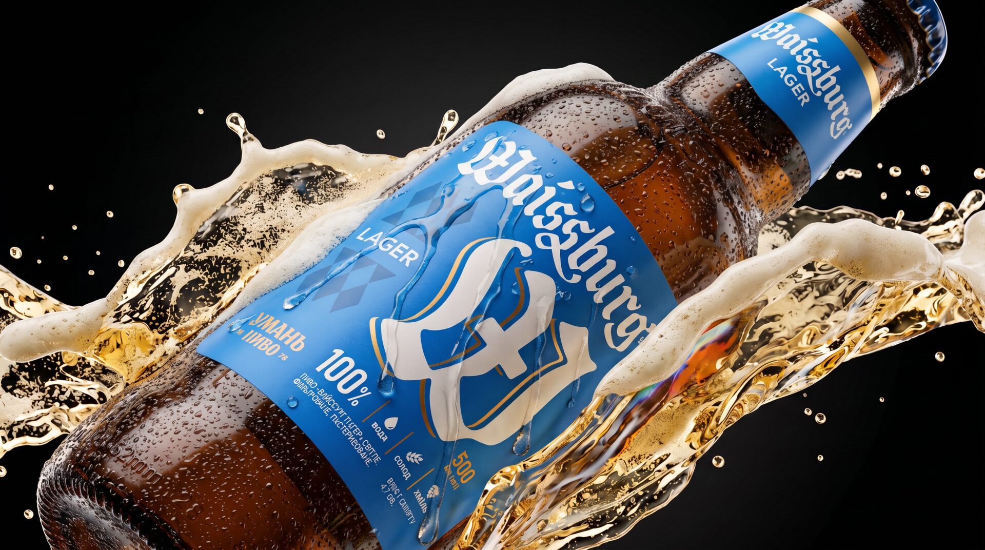
How do you refresh a brand that already has its own history, recognition and character?
This was the challenge Umanpivo brought to us: to refresh the design of Waissburg, its flagship beer line.
Waissburg already had an established visual identity, so the task was not to create a brand from scratch.
Instead, we needed to understand which elements were truly contributing to its character and recognition, and which ones were no longer working.
The previous design used a sun motif as one of its central elements, but it didn’t create a strong enough connection either with the product or its character.
The main challenge was therefore to refresh the brand’s image without losing its recognisability.
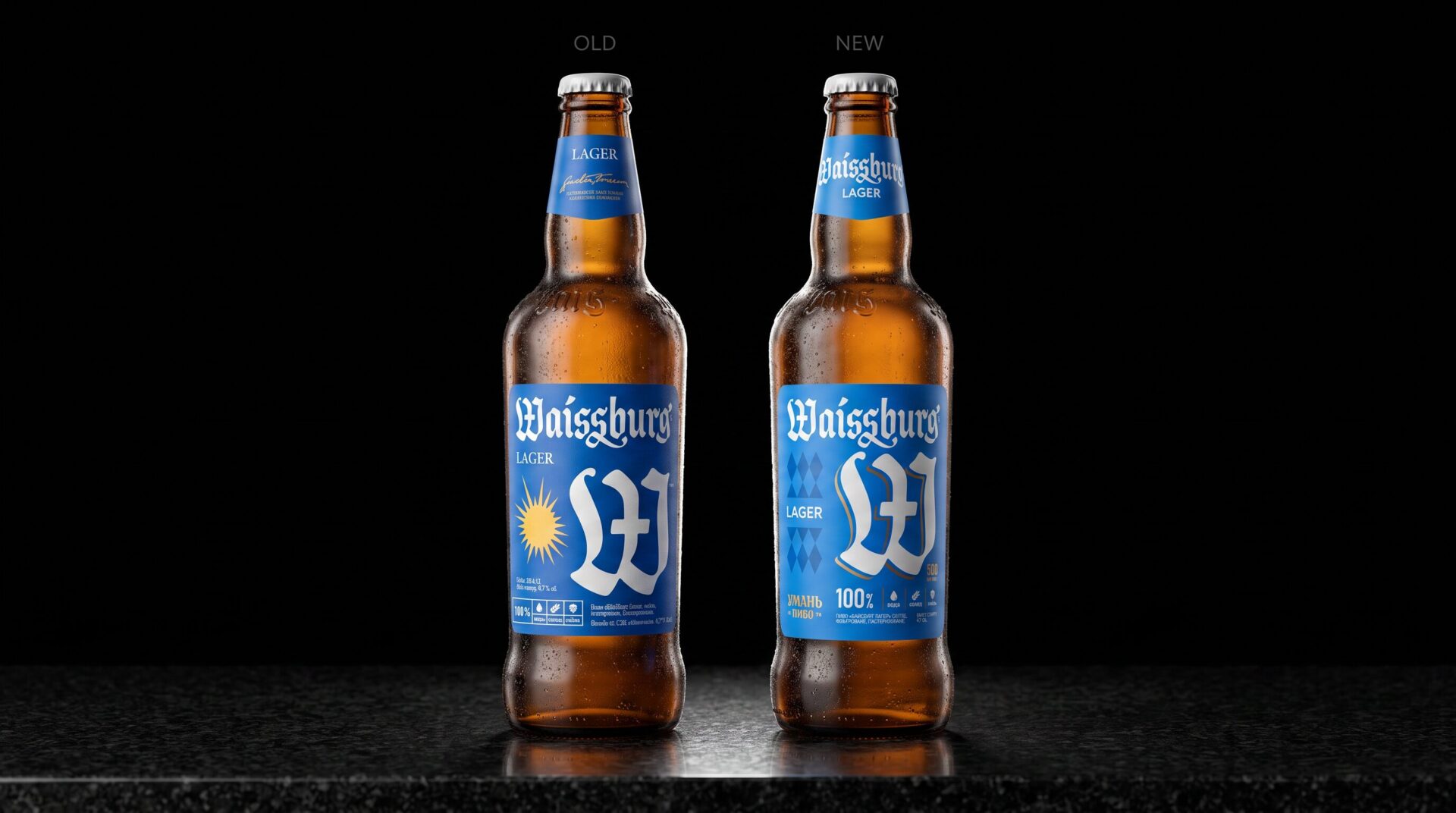
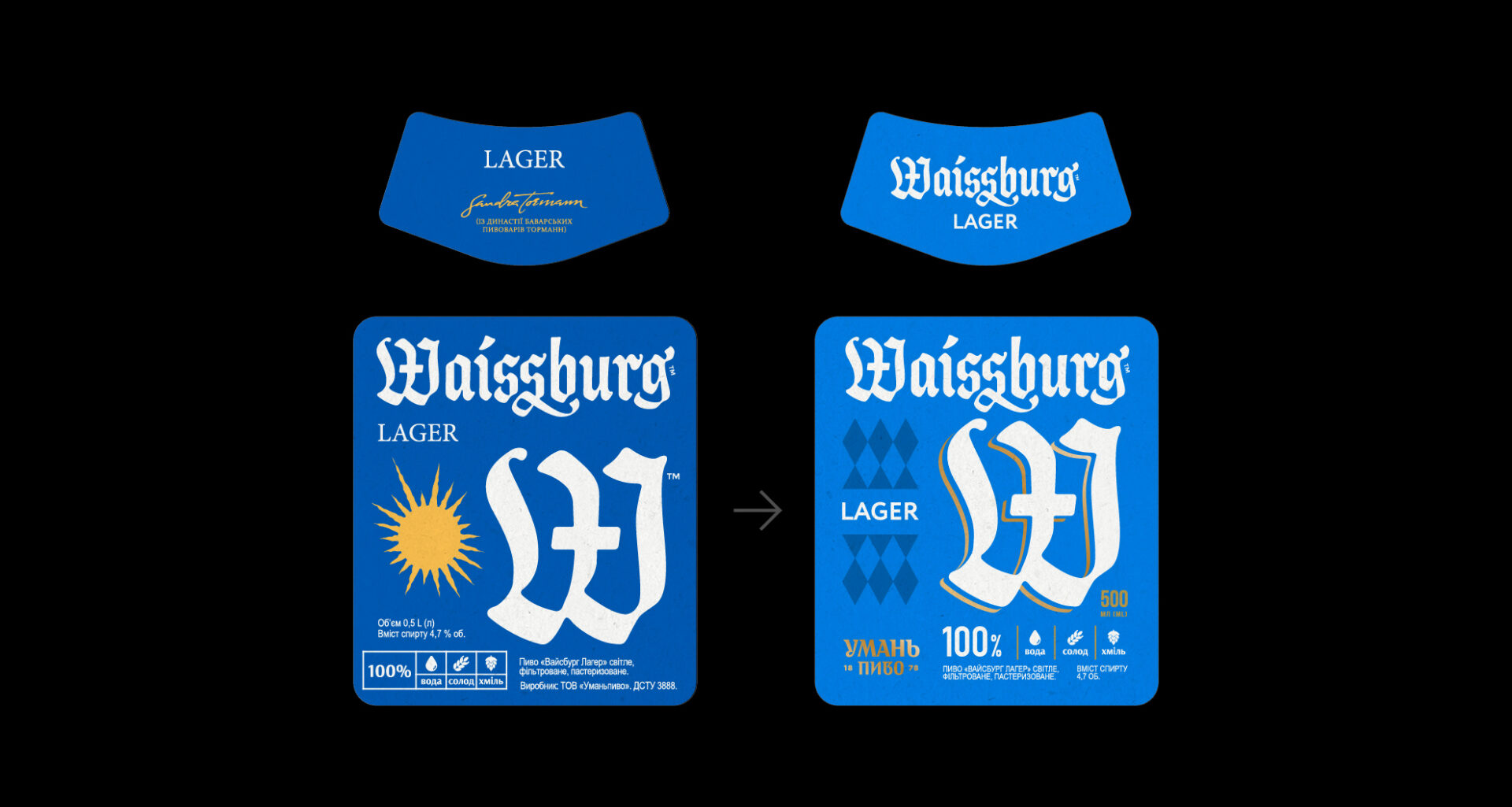
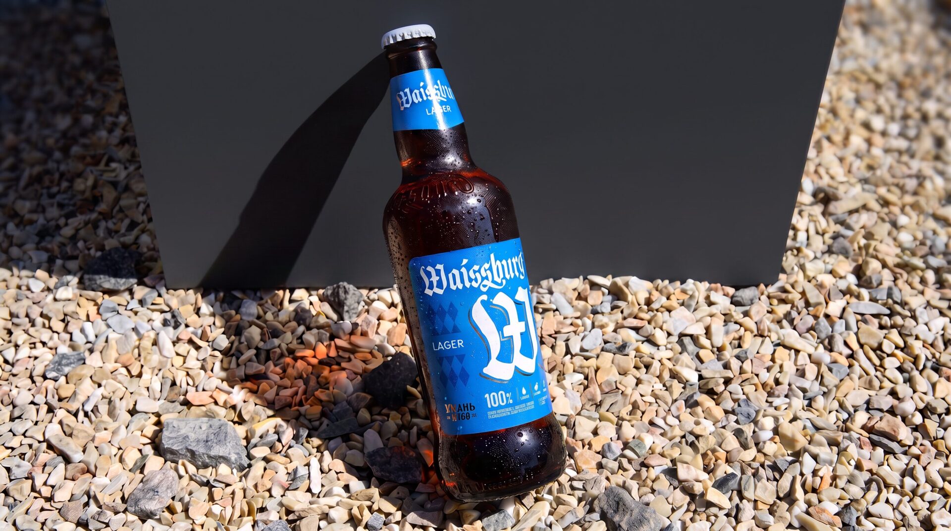
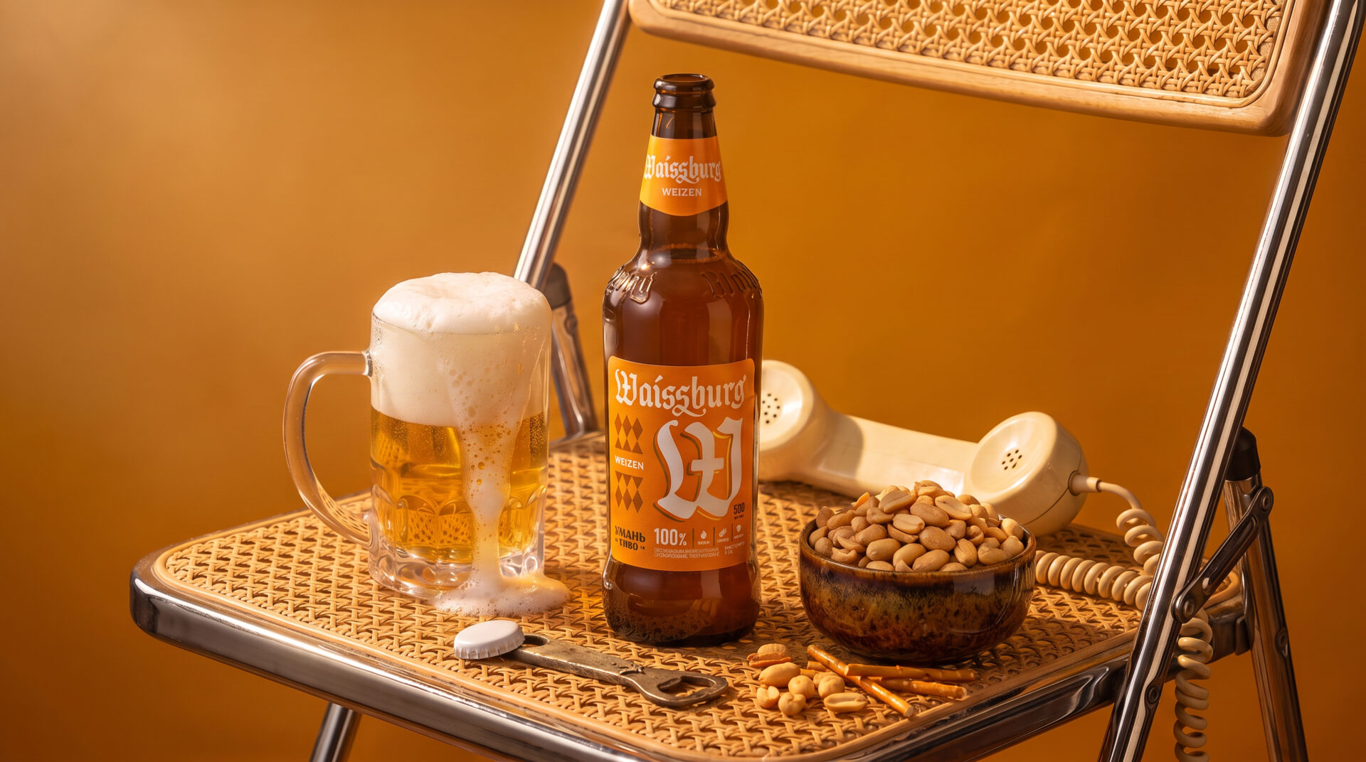
Waissburg has German roots, so we decided to make this part of the foundation of the new visual direction. Instead of using a literal representation of the sun, we turned to traditional Bavarian aesthetics.
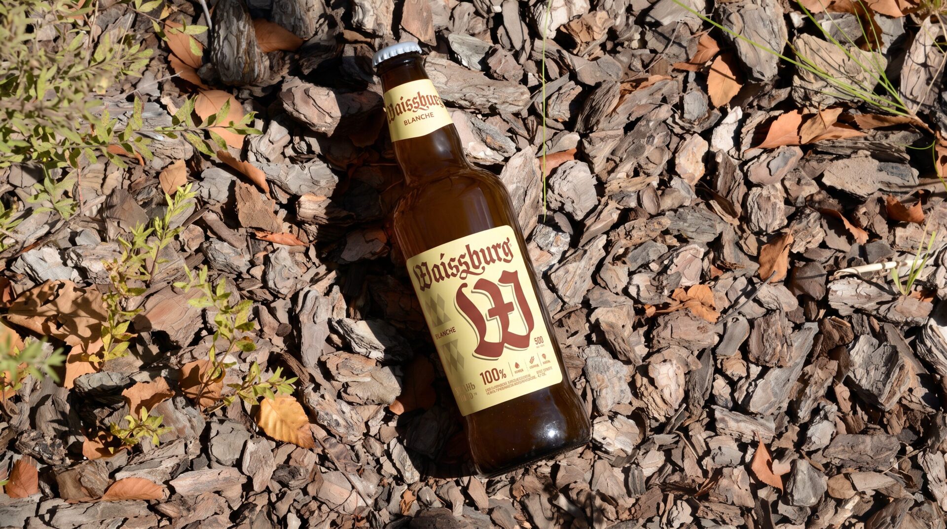
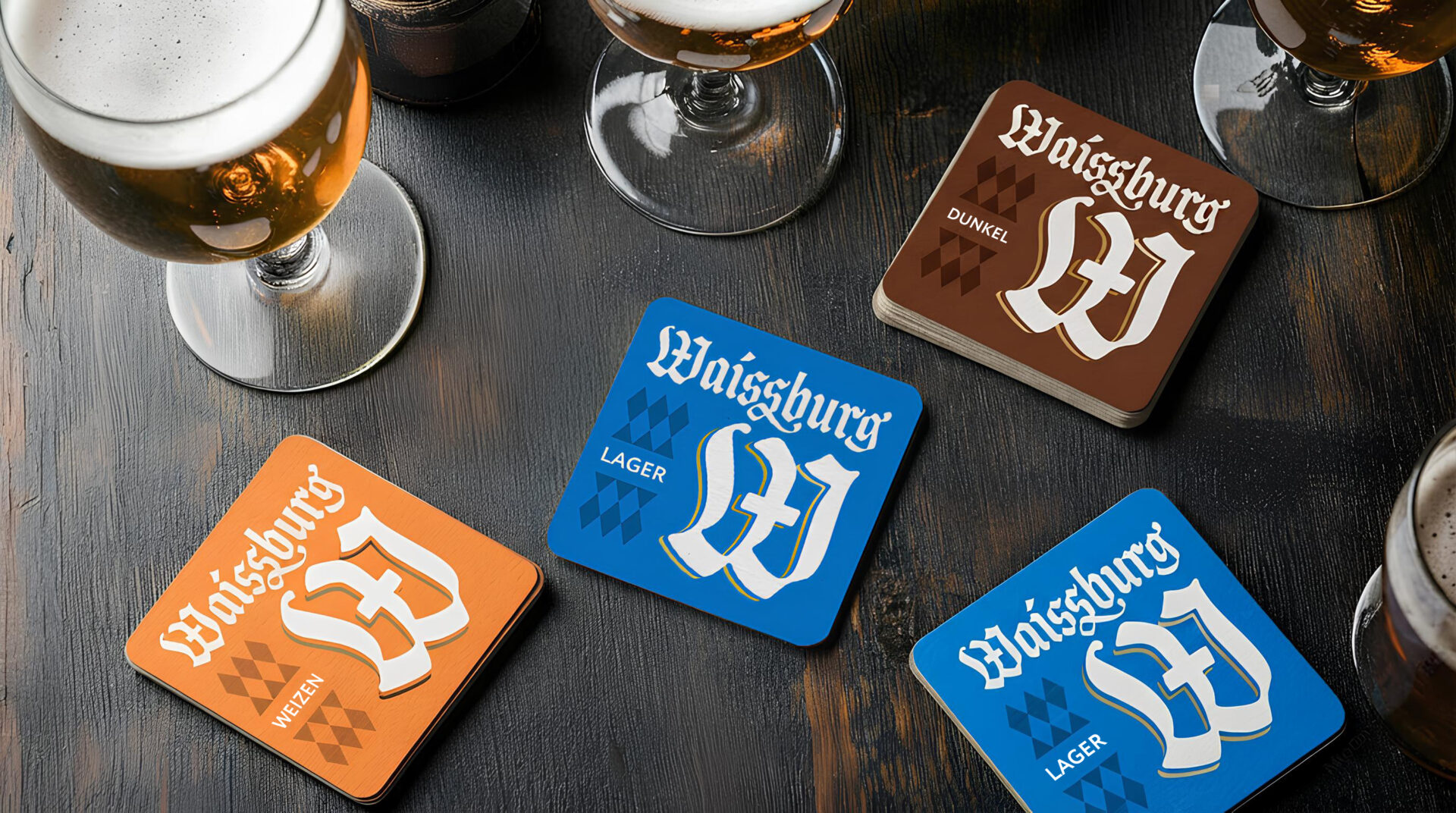
The diamond pattern became a key graphic element of the new system.
This familiar Bavarian motif helped emphasise the German character of the beer while creating a simple and recognisable element that could be consistently applied across the whole range.
visual
solution
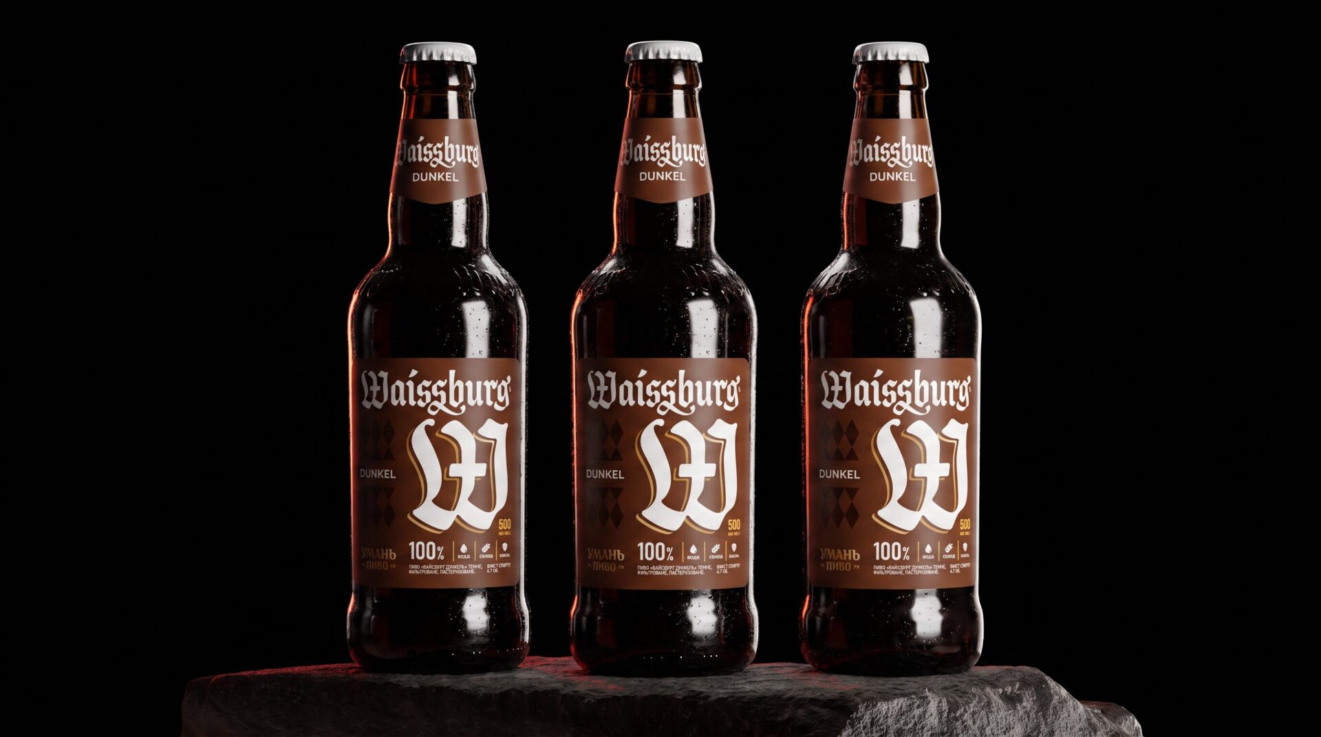
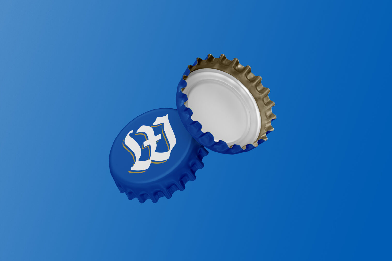
We didn’t want to completely change Waissburg’s visual language. Instead, we kept the distinctive W and the brand logo, as both already carried the German character we needed and contributed to the brand’s recognition.
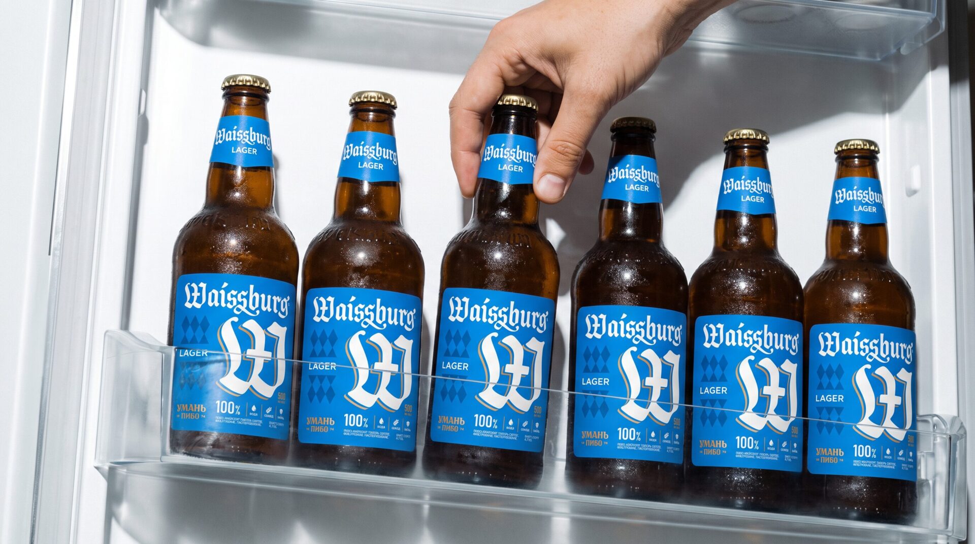
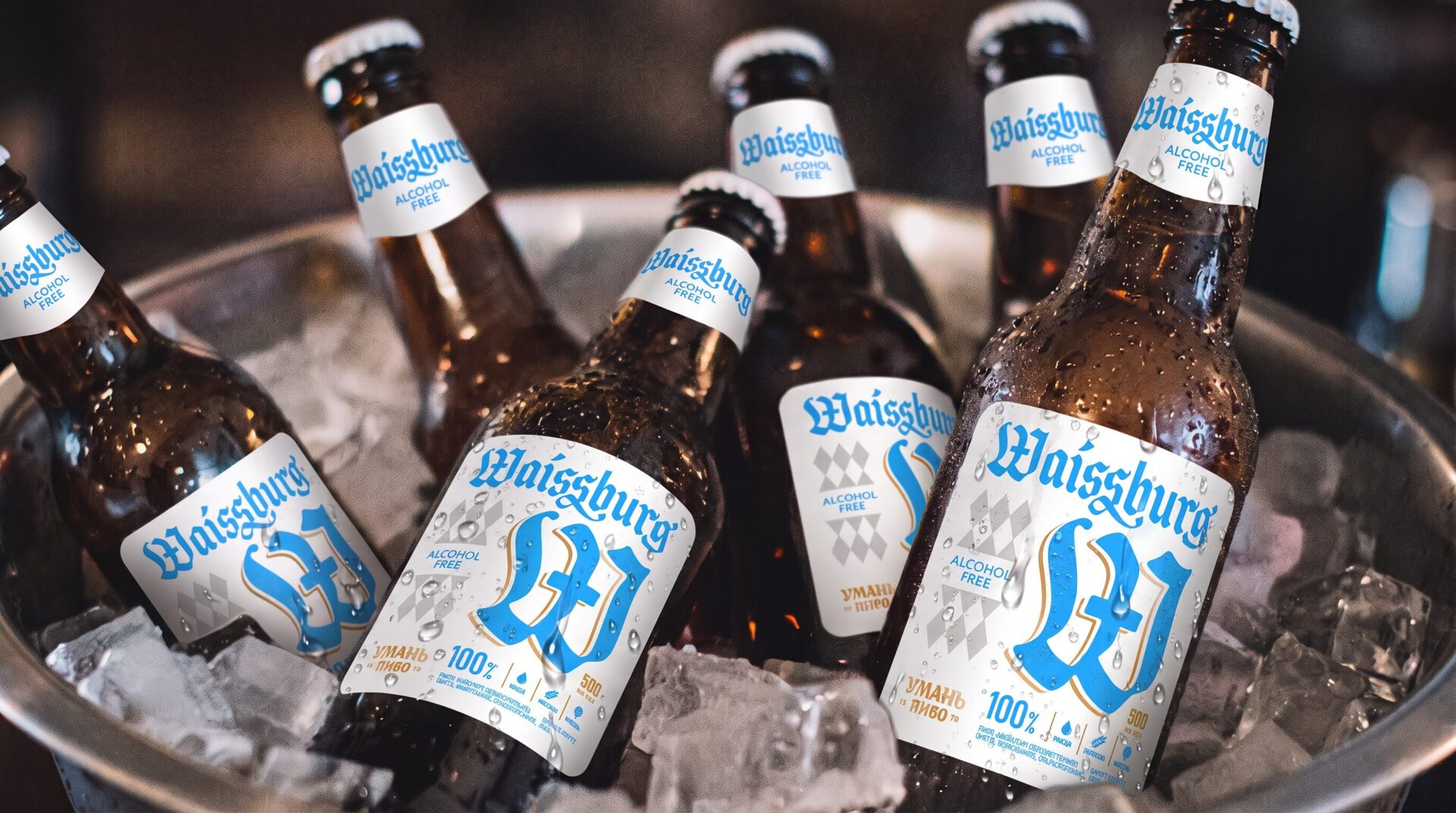
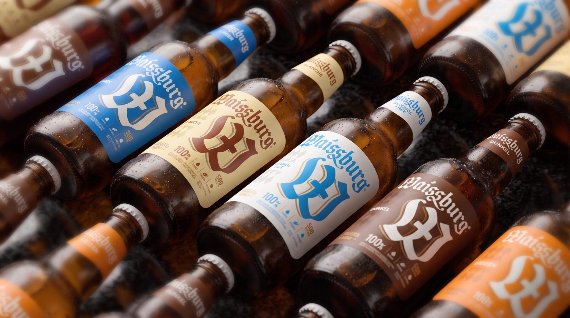
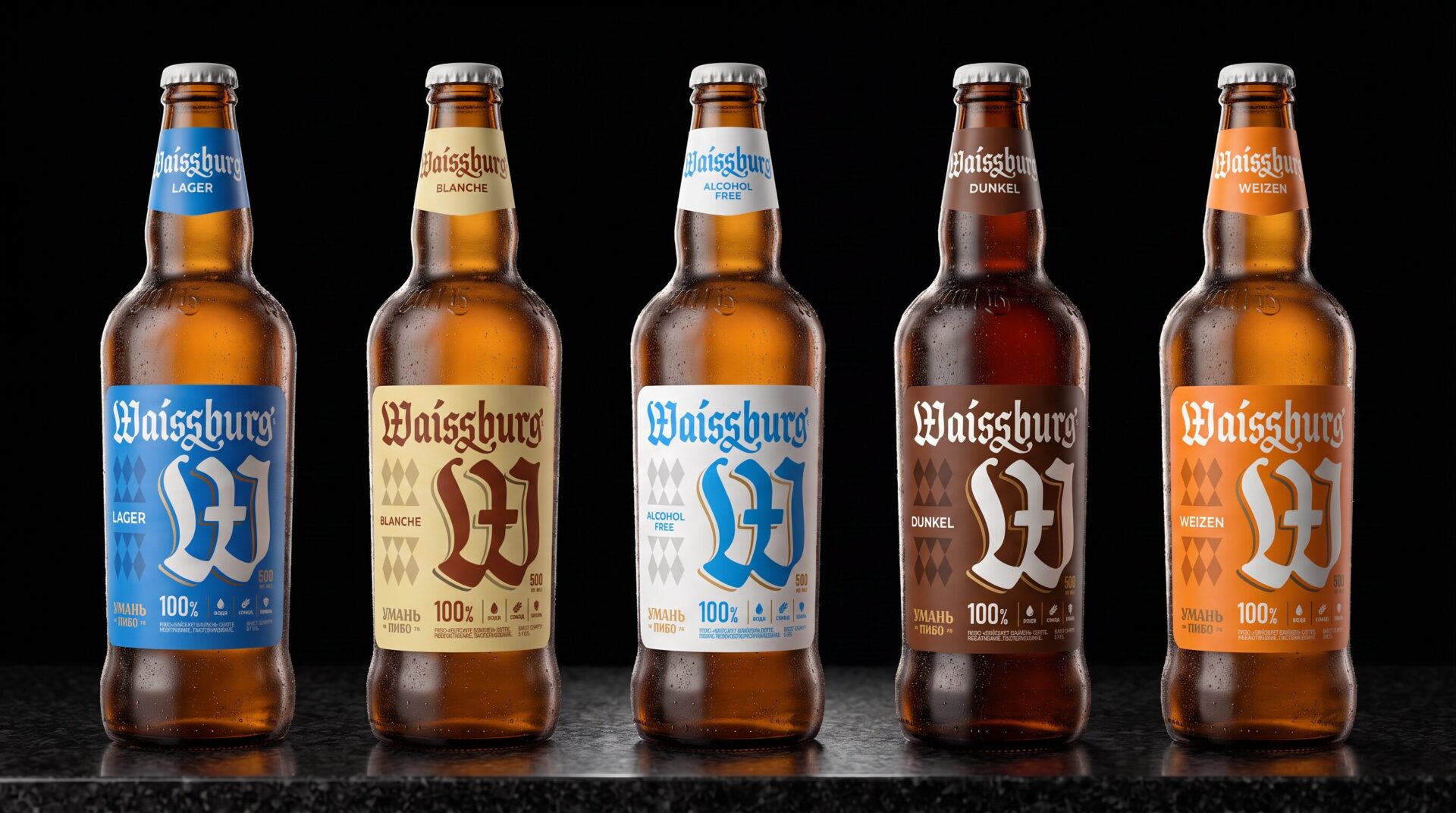
The new visual direction was built around a clearer graphic system, with the Bavarian pattern becoming one of the main elements of the composition. It helped make the labels more expressive and cohesive, while creating greater consistency across the range.
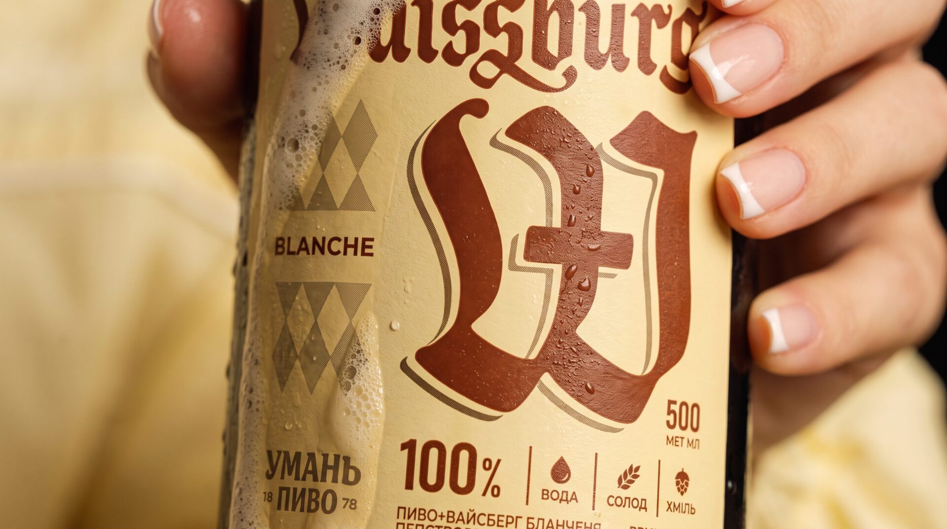
Finishing and print techniques also played an important role. We introduced gold foil to selected elements of the labels, adding a more refined and premium feel without making the design look overly classic or outdated.
Combined with the updated graphics, it helped give Waissburg a more contemporary expression.
Restyling always comes with boundaries — and that is what makes it unique.
When a brand already exists, you can’t simply erase everything and start over. You need to identify the elements worth keeping and understand where there is room for change.
For Waissburg, we looked for a balance between the familiar and the new: keeping what contributes to the brand’s recognition while rethinking the visual elements that were no longer working effectively.
As a result, the brand gained a more expressive, contemporary and premium image that still speaks the language of Waissburg — but with greater confidence.
team
Project Manager — Serhii Maksiutenko
Brand Designer — Andrii Hetmanchuk
Marketing Director — Vadym Pustotin


